Momento
Turning memories into meaningful works of art
Momento
Turning memories into meaningful works of art
Momento
Turning memories into meaningful works of art
Momento's mission is to turn people's most treasured memories into long-lasting works of art from artists around the world.
The project required a full working prototype of a desktop- and mobile-ready web app, that guided users from artist & style selection to describing their memories and then working with the artist as the artwork is created.
I was brought on as a junior UX designer to help with the user flow, wireframing, prototyping, and interface design of the Momento web app and marketing site.
WORK
User Interviews
UI/UX Design
Prototyping
PROJECT TYPE
Web App
Marketing Site
ROLE
Junior Designer
TIMELINE
3 weeks
The Problem
How do we help users turned cherished memories into lasting works of art?
The concept is deceptively simple: let users request a piece of art based on a memory or event in their life. But turning this concept into a tangible series of steps and inputs prompts a series of questions.
How do people recall their memories? What things do they remember first? And what information does the artist need to create an impactful recreation of such an important memory?
The Flow
Due to the project's short turnaround, an initial user flow was mapped out even as research was still underway.
The lead UX designer on the project created this flow chart, which we could challenge and test as the project went on and research data came in.
The journey starts with users choosing the artist, art style, and medium for their Momento piece. Then it takes users through the steps of describing the memory, including who was there, where it took place, and any additional details to help the artist. Users have the option to upload reference photos for nearly every step of this process.
Finally, once the memory is described, users will need to communicate with their artist as initial sketches and rough drafts are created, to ensure the work meets expectations.
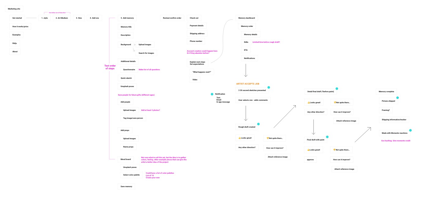
Select Artist & Style → Create Memory → Place Order → Work with Artist
The Research
Memories are a fickle thing.
We began by asking friends and family to recall meaningful memories, taking careful note of what details they recalled and in what order.
After the initial round of responses, we began noticing that the only consistent thing was inconsistency. Some participants started with the time of year, some started with what they were wearing. One participant described nearly every other person present before getting to the main subjects of the memory—herself and her spouse.
Not to be deterred, we could still conclude that memories can contain multitudes. Even if we found details to be unnecessary, they clearly mattered enough to the user to be mentioned at all, and would thus create even more joy for them if included in the final art. Our product needed to be flexible enough to allow for these details.
The first change we made was to eliminate the "questionnaire" portion of the process, where we'd ask additional questions to prompt the user's memory. We feared this would only box them into the items we deemed important, rather than allowing their memory to take shape organically. Instead, we added more open-ended inputs into other steps of the process.
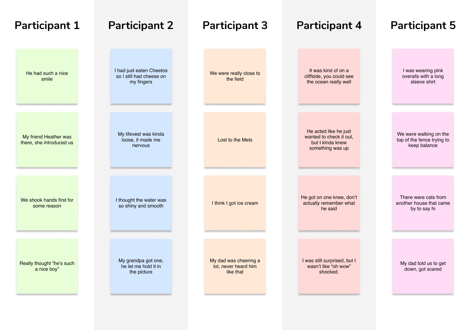
Our product needed to allow users the chance to include all of the unique details their memory had retained.
From outline to the final product.
The Prototype
The lead designer started designing out the mobile version of the site, while I adapted it for desktop and added elements as needed.
For me, this presented unique challenges I hadn't encountered before. My initial thought was to stick to the mobile experience as much as possible, and not veer too far from its design. I thought this would benefit the developers and help keep the desktop site as responsive as possible.
In reality, this made the desktop version look far too primitive. I got feedback from both the lead designer and the developer that the desktop looked too much like the mobile version, and wasn't taking advantage of the extra screen real estate.
With guidance from the lead designer, I was able to rework the desktop design into something that maintained the same flow and feel as the mobile version, while also making it more appropriate for a desktop experience.
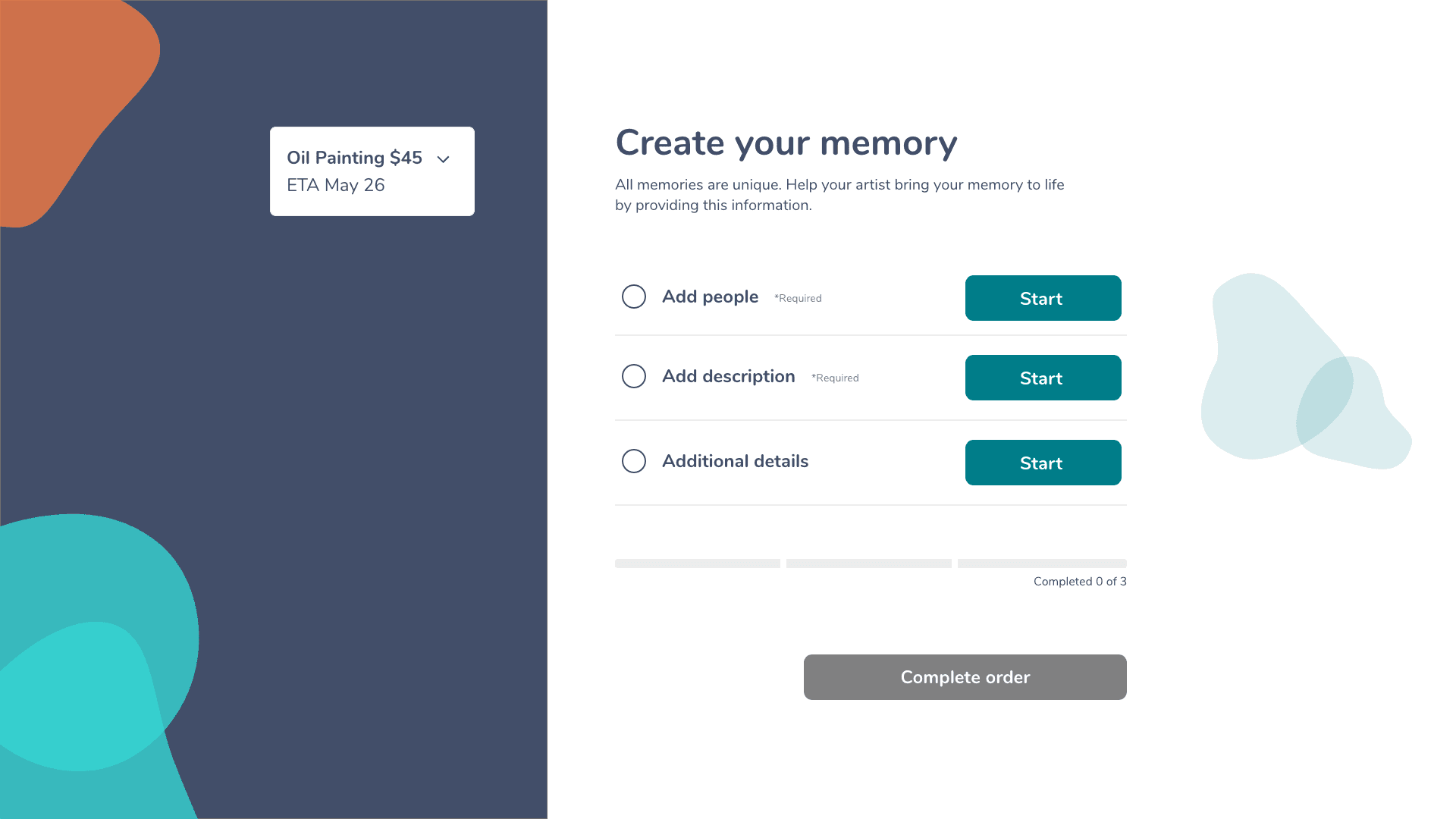
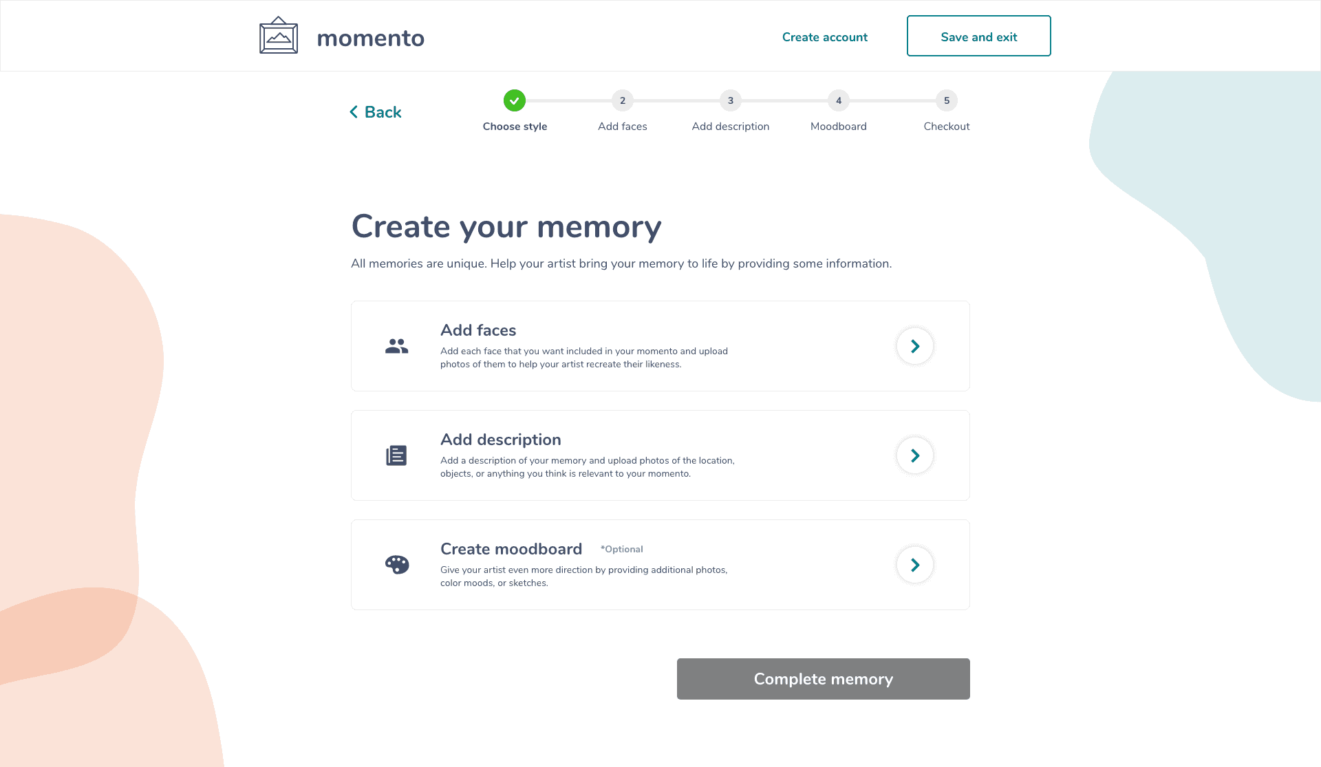
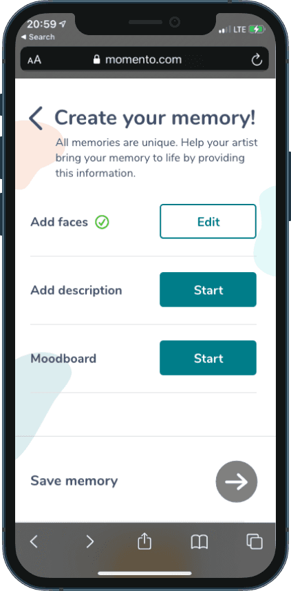
The Create Memory overview screen, showing the steps needed to describe your memory for your artist.
My final design added icons, microcopy for each selection, and a more descriptive progress bar to add context for the user on what was coming next.
The Testing
As soon as we had a working prototype for even just one task, we started testing with users.
The things we learned in these tests were invaluable, especially as we tested with the target persona for Momento—25-40 year old women who were prone to using Instagram or Pinterest.
A key learning from this was the use of the "moodboard" at the end of the Memory Creation flow. We had tested out this section as "additional details," with the "moodboard" set as a sub-task within it, where users chose reference photos from a catalog of stock photos.
Because users were drawn to the moodboard creation feature, we expanded it and made it a prominent step in our user flow.
But as we tested this section we noticed that users latched on to the moodboard section and wanted to spend extra time customizing it. Coming from Pinterest, the concept of a moodboard was very familiar to them, and encompassed all aspects of the visual look—colors, photography, mood, and layout.
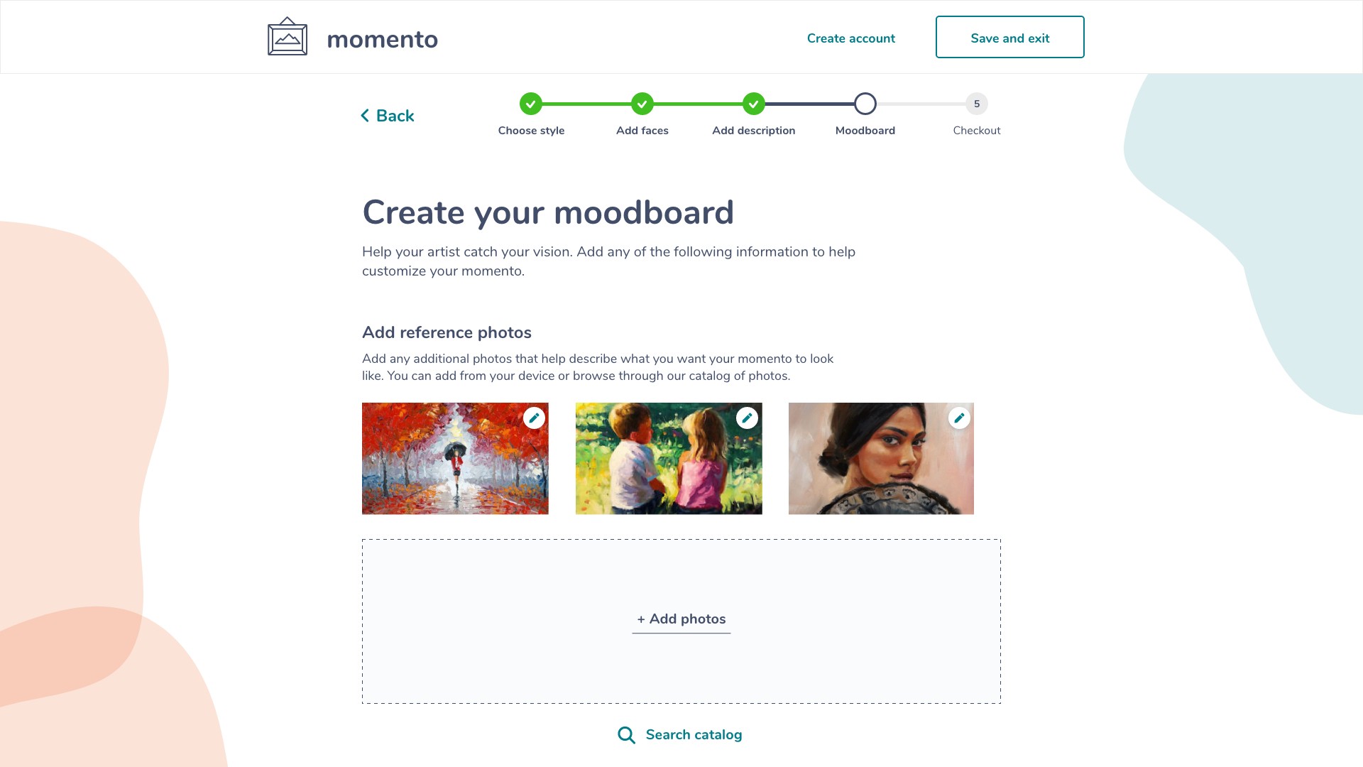
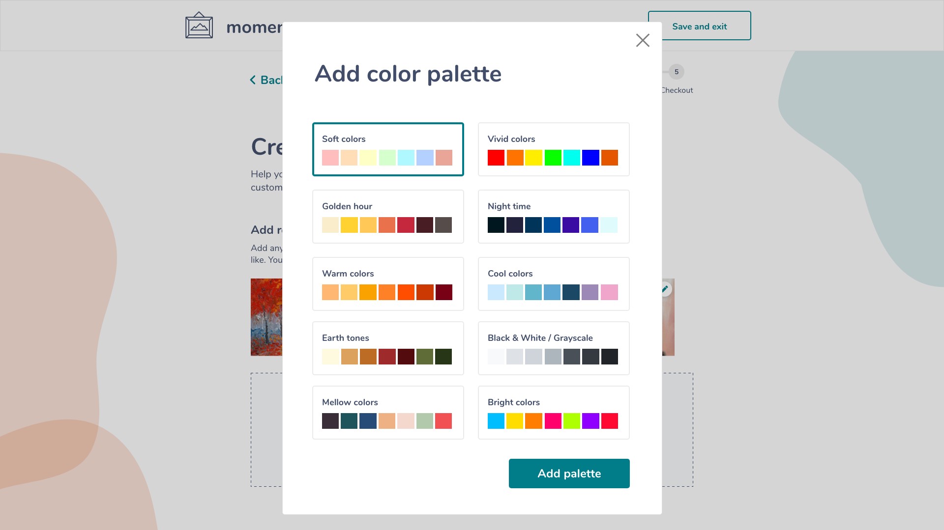
As a result we turned the entire third section into a "Moodboard" creation flow, letting users add photos and a color palette to help the artist nail their vision.
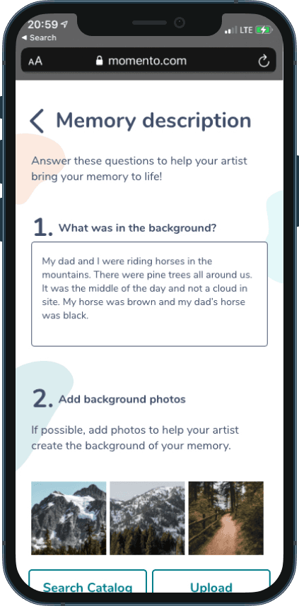
Users can add their own photos or browse a catalog of stock photos to help the artist know the mood they're looking for.
We initially tested a color picker tool for the Color Palette feature, but found the specificity too confusing for users.
The Product
We completed the project as a full prototype of both the mobile and desktop versions of the web app, plus the marketing site where users browse artists and begin the momento ordering process.
I was responsible for the desktop version of the web app, and assisted with the creation of the marketing site on both mobile and desktop.
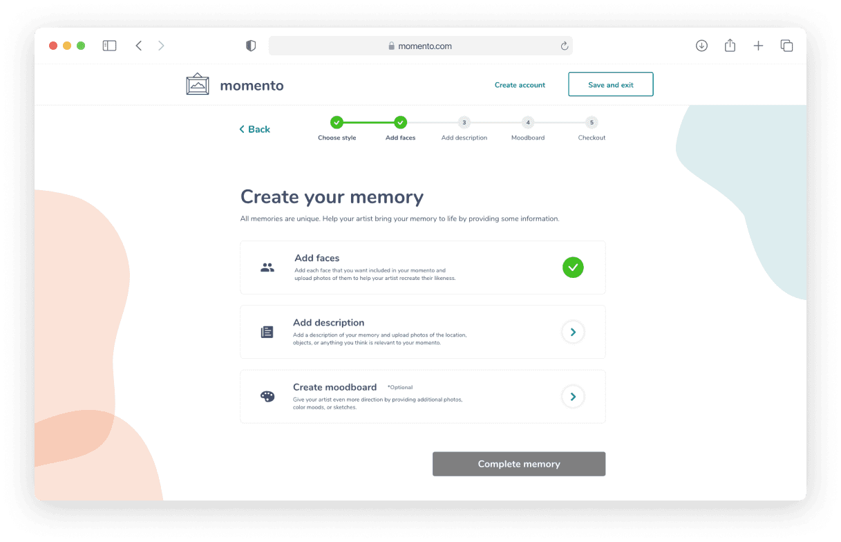
The Memory Overview page went through a few iterations, at one point having five steps for users to complete before checkout.
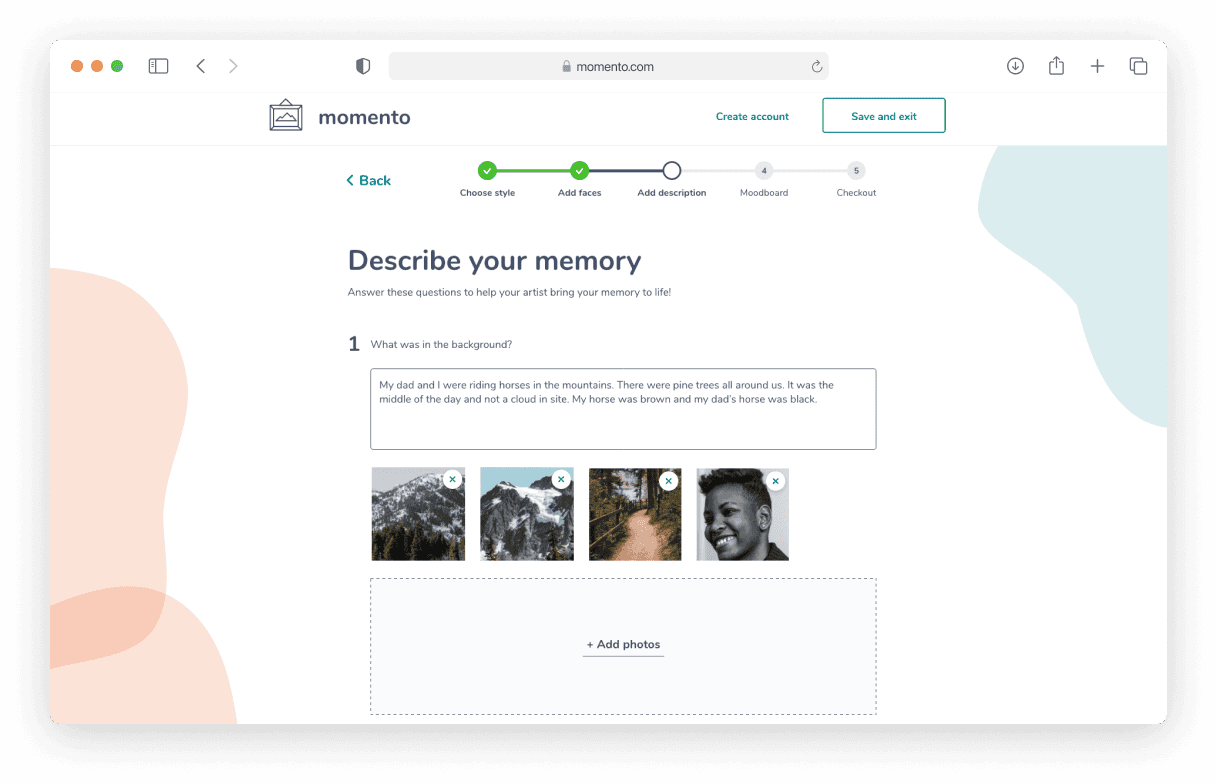
This step started as a "Describe Background" step for users to describe the location, but we changed it to "Describe your memory" to allow room for other details to be added, and not restrict users to just the setting.
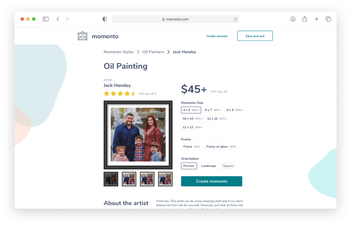
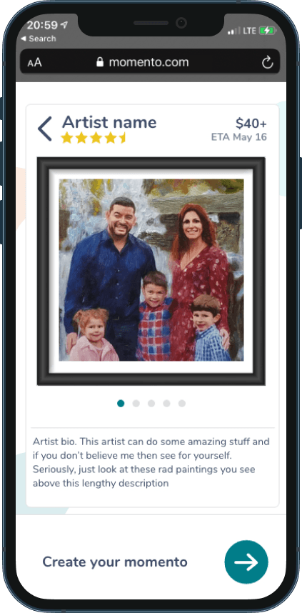
We chose to turn the artist and style selections into an e-commerce style product page, based on our persona's familiarity with online shopping.