Blip Billboards

Making billboards possible for any business.

Blip Billboards

Making billboards possible for any business.

Blip Billboards

Making billboards possible for any business.

Blip turned digital billboard space into a self-serve advertising platform, giving small- and medium-sized businesses unprecedented access to out-of-home (OOH) advertising.

I was brought onto the marketing team to run online ads and produce video content, before transitioning into a new role leading website design efforts.

The Hero Section

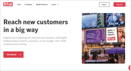
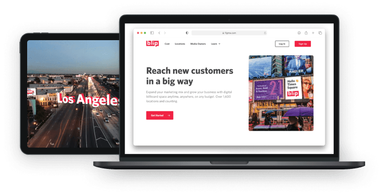
As the first touch-point for most users, the hero section of Blip's home page needed to position Blip as an exciting way for users to market their brand or business

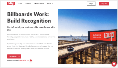
The existing hero section contained a considerable amount of text next to a photo of a Blip sign in a rural area with two visible cars. Not exactly the best way to tell users that billboards give you big exposure.

Swapping out the photo for one featuring our Times Square location, paring down the H1 and description, and removing the extra link below the CTA, resulted in a 31.9% increase in conversion rate among new users.

31.9% increase in conversion rate

The Cost Page

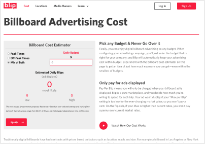
As the second-most visited page among new users, Blip’s Cost page needed to be an approachable way for users to understand Blip’s unique pricing model.

Blip’s biggest draw to marketers is its flexible pricing. Advertisers can spend as much or as little as they want, as low as $5/day in some locations.

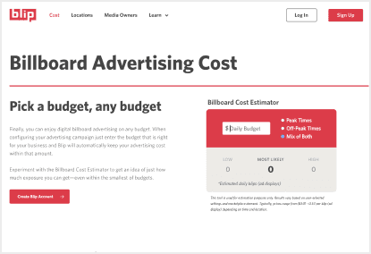
But this doesn’t answer their question of “okay, then what's the value?” Blip solved this early on with a Cost Estimator tool, to estimate ad displays based on a daily budget, but the design of the tool and the walls of text next to it were leading to more questions than answers.

A simple redesign of the tool plus some copy editing resulted in a 18.5% increase in conversion rate among new users who visited the ‘/cost’ page.

18.5% increase in conversion rate

The Rest

Working on the marketing team allowed me to stretch my legs creatively, and produce video and website content for a variety of campaigns and initiatives.

*Created all graphics and footage below, minus the drone footage

The Rest

Working on the marketing team allowed me to stretch my legs creatively, and produce video and website content for a variety of campaigns and initiatives.

*Created all graphics and footage below, minus the drone footage
The Rest

Working on the marketing team allowed me to stretch my legs creatively, and produce video and website content for a variety of campaigns and initiatives.

*Created all graphics and footage below, minus the drone footage
© 2024

© 2024

© 2024